DLG, digital line graph, is a form of a digital map created by the USGS that uses a topological vector model. This map shows contours, roads, section lines, lakes and streams.
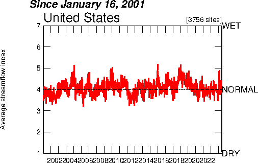
An Index Value Plot is a type of visualization map and is plotted on a line graph as shown above. It is used to show an index of measurements. This example shows the air quality index for the statistical areas.
Standardized choropleth maps compare differences and variances in an area by showing those differences in different shades as displayed above. The map displayed represents the population percentage of kids that are 14 years old and younger for the year of 2006. As the table in the map shows, the darker color represents a higher percentage and the lighter colors represent lower percentages.
The histogram is a graph showing data in various ranges. The groups of data are classified as classes, although in a histogram classes are called bins. Histograms are considered to be useful data summaries that provide the general shape of the frequency distribution. They are also used in combination with boxplots.
Windrose maps are a way of evaluating data that is related to wind direction. They are used my meteorologists when charting weather conditions and the wind speed and direction at specific locations. They are also important when constructing an airport runway due to wind speed having a large affect on planes taking off and landing.
A triangular plot, also known as a ternary plot, is a triangular diagram that has three value plots which total to a constant. The ratio used in this equilateral triangle is divided in three variable positions.
A univariate choropleth map depicts a single data set and is generally east to read as it consists of the map along with a legend to supply information to the reader. The map above shows poverty in the United States, by county.