This bivariate choropleth map is of Africa and shows the land use, life expectancy and GNP per capita in Africa for the year of 1989. The country names are not labeled and the map only provides high level general information.
The nominal area choropleth map displayed above is used to display nominal data. This map is of the southern Balkins and is used to show quantitative differences.
Isoline map have continuous lines joining points of the same value. The map here shows the isolines of magnetic field inclination along the east coast of the U.S.
Box plot maps are used to summarize a set of data. The map above displays scores from site samples of a creek. Box plot maps are also known as Whisker Plots.
Parallel coordinate graphs use parallel coordinates to show statistics. This type of graph is used to plot a large set of data. The map above shows baseball statistics however no timeframe is provided.
Stem and Leaf plots are displayed in the form of a graph as shown above. The title is shown at the top and the data is displayed in the bottom portion. This type of map is used to plot simple data in an effective way.
DRG, digital raster graphic, is a scanned copy of a USGS topographic map. It represents all georeferenced images on earth. The above graph image is of a river in Colorado.
DLG, digital line graph, is a form of a digital map created by the USGS that uses a topological vector model. This map shows contours, roads, section lines, lakes and streams.
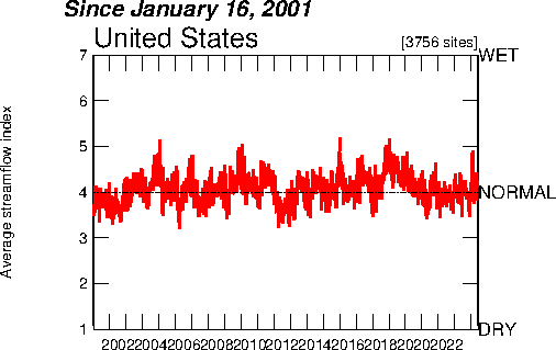
An Index Value Plot is a type of visualization map and is plotted on a line graph as shown above. It is used to show an index of measurements. This example shows the air quality index for the statistical areas.
Standardized choropleth maps compare differences and variances in an area by showing those differences in different shades as displayed above. The map displayed represents the population percentage of kids that are 14 years old and younger for the year of 2006. As the table in the map shows, the darker color represents a higher percentage and the lighter colors represent lower percentages.
The histogram is a graph showing data in various ranges. The groups of data are classified as classes, although in a histogram classes are called bins. Histograms are considered to be useful data summaries that provide the general shape of the frequency distribution. They are also used in combination with boxplots.
Windrose maps are a way of evaluating data that is related to wind direction. They are used my meteorologists when charting weather conditions and the wind speed and direction at specific locations. They are also important when constructing an airport runway due to wind speed having a large affect on planes taking off and landing.
A triangular plot, also known as a ternary plot, is a triangular diagram that has three value plots which total to a constant. The ratio used in this equilateral triangle is divided in three variable positions.
A univariate choropleth map depicts a single data set and is generally east to read as it consists of the map along with a legend to supply information to the reader. The map above shows poverty in the United States, by county.
Scatterplot uses a coordinate plane to show the data of two variables. The variable is plotted on the X axis and response variable is on the Y axis. Between the two variables, it includes the strength, shape, direction and presence of outliers.
Population profile is a graph that elevates the qualities or characteristics of a particular group of individuals. The population profile information is utilized on a X and Y axis graph. The example above depicts the number and ages of immigrants that migrated to the United States in 2006.
Climographs show the temperature and precipitation in different areas. It also explains the difference between weather and climate. The illustration above is from NASA and is data taken over a period of time in Guam. Climographs are created using Microsoft Excel.
Range graded proportional circle maps are maps that describes data in the form of circles. This map represents river characteristics in different colors.